Spring brights
So, who’s in the mood for a little color inspiration today? We always forget how fun these palettes are to dream up. With all the spring editorials to gush over as of late, the possibilities are endless.
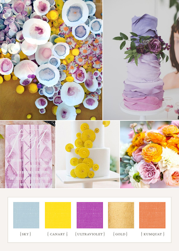
If this year’s spring wedding trends have taught us anything, it’s that it’s A-ok to swap out the pink in favor of a more surprising shade (kumquat, anyone?). Purple hues are great alternatives too.
Spring pastel tabletop inspiration
This time with a new palette of Spring colors and a sweet blossom table setting. Compared to last week’s post this set is definitely more on the softer side, but nonetheless has us excited about the possibilities of pretty in pink tables in the future.

Bright, spring tabletop inspiration from Antiquaria
This one is so vibrant and fun and just screams spring, don’t you think?

How color palettes and inspiration you collect can translate to beautiful tabletop decor. Isn’t that fun?
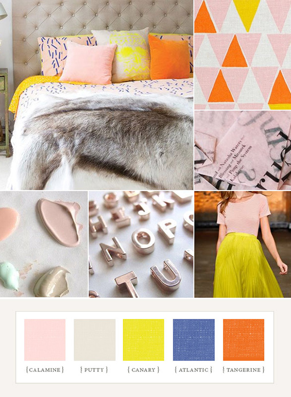
Spring brights again
Spring marks the official start of wedding season, and we know that so many of you are in the midst of planning your own warm-weather soirees right now. So to get you in the mood, we put together this cheery little set of colors that would be just perfect for a spring wedding. It’s a mix of sunlit brights, paired with ‘calamine’ pink and ‘putty’ gray, aka our new favorite neutral.
source from: www.100layercake.com